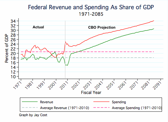
The second is that the CBO (Congressional Budget Office) projection of what will happen under the current budget projections departs markedly from this long-term average and climbs sharply into "Greek default land" in only a few years. Clearly this is unsustainable.
The administration claims all sorts of terrible things will happen if we cut back spending to what it has been (as a percentage of GDP) over the past 40 years. That seems a bit of a stretch, since the government seemed to do fine at its historic levels of spending (though of course building up a big debt as it did so).
For the long term, clearly the government has to get revenue (green line) and spending (red line) to at least the same percentage of GDP, if it is to stop increasing the federal debt. Preferably it should strive to get some surplus so it can pay down some of the current debt, if for no other reason than to have room for the option of more "stimulus" spending in future recessions (if one is a believer in Keynesian economics).
But the main message of this chart is simply that the administration's current budget plans are simply a fantasy. There is no way we could sustain them. And three years into his presidency, President Obama has yet to propose a plan that gets us out of this mess -- that clearly is the Democratic party's biggest failure to date. Republican have yet to propose a viable plan either, but at least they are striving to cut the spending, and forcing the administration's hand on this.


